Scalable Design Systems
At the core of the Spruce style guide
Building blocks to make it easier for users to read & find the information they need
Summary
Typography is the art and technique of arranging type to make written language legible, readable and appealing when displayed. The arrangement of type involves selecting typefaces, point size, line length, line-spacing (leading), letter-spacing (tracking), and adjusting the space within letters pairs (kerning).
MVP Style Guide
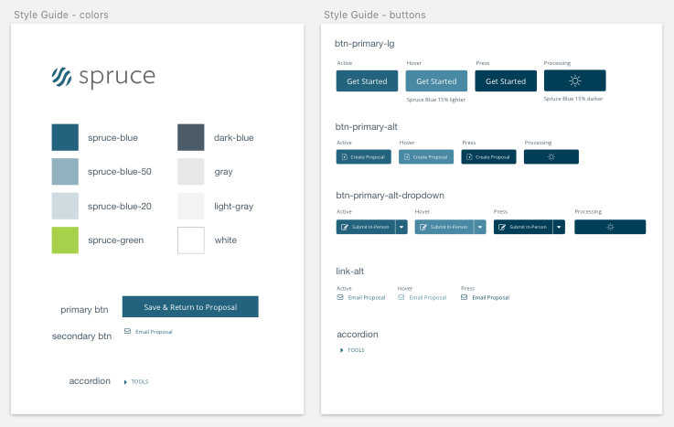
When I started designing for the SpruceFlow web application, there was a bare-bones style guide in place.
- Styles that worked within the Bootstrap framework
- Allow for easy handoff to developers
- Create more consistency in designs from hi-fidelity mockup to implementation
Design Fundamentals
Elements
Rather than continue with custom-built elements like buttons and form fields that had been implemented in the software, I advocated for the use of the Bootstrap framework of components. This allowed for easy stylistic customization to align elements with the Spruce brand while also reducing development time.

Wireframes
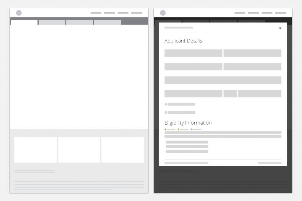
Additionally, I created simple wireframe elements and layouts that allowed project managers to explore ideas for features themselves.

Developer Handoff
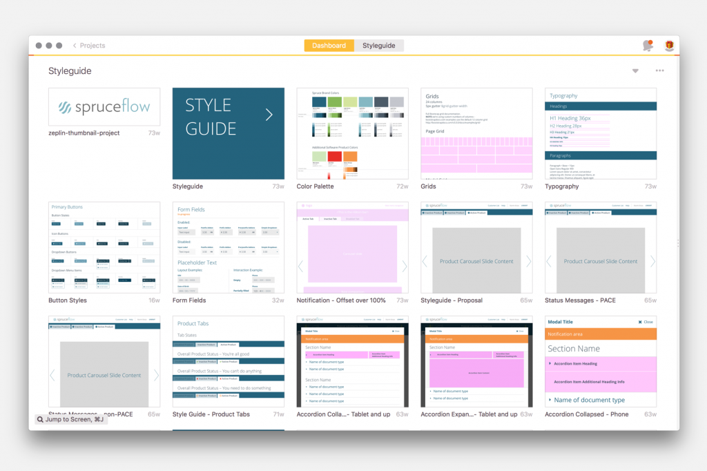
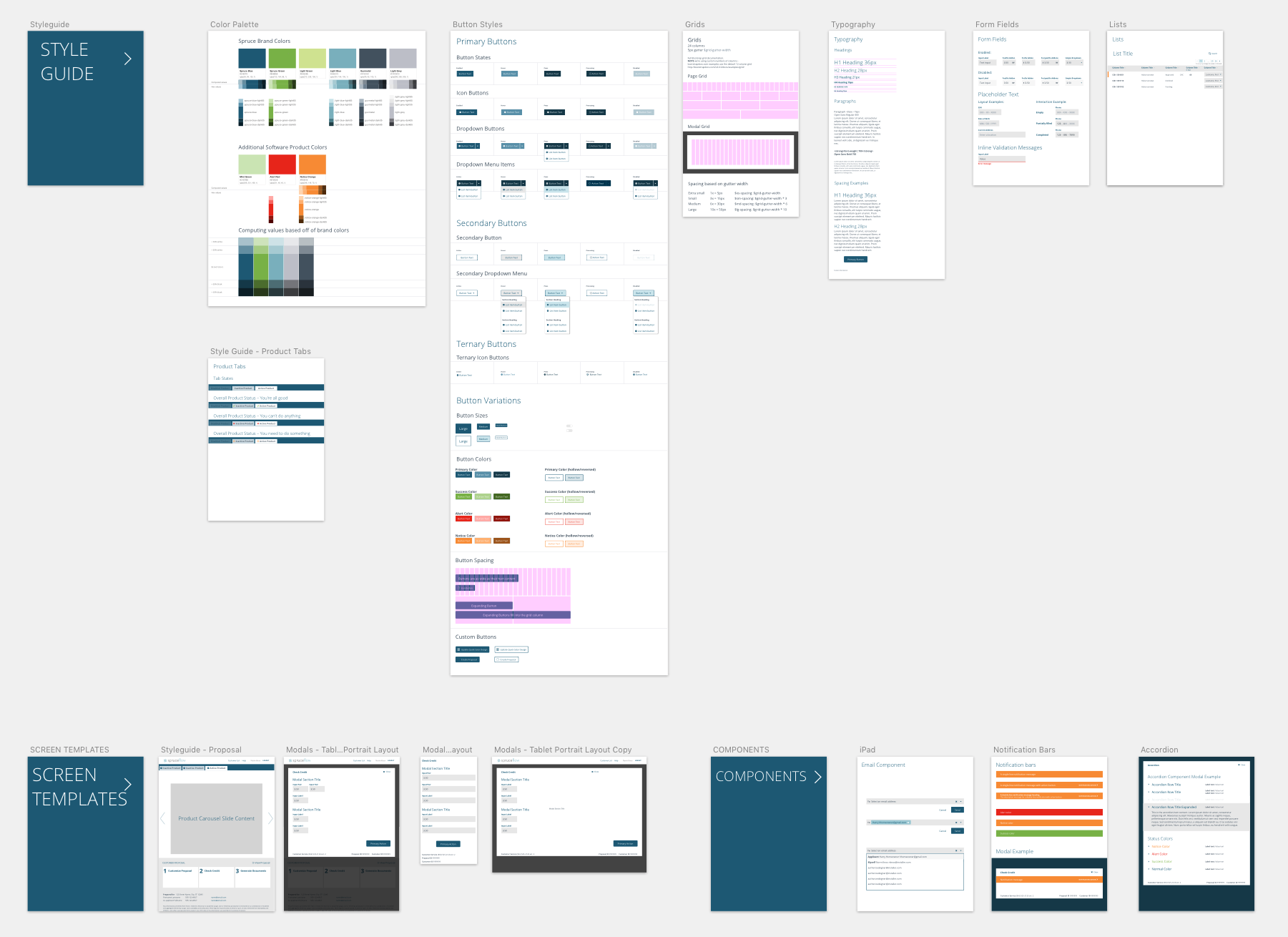
Created in Sketch, the style guide was shared with developers in Zeplin.
Also pairing with developers while features were implemented which reduced tickets rejected for visual reasons during the QA process.

